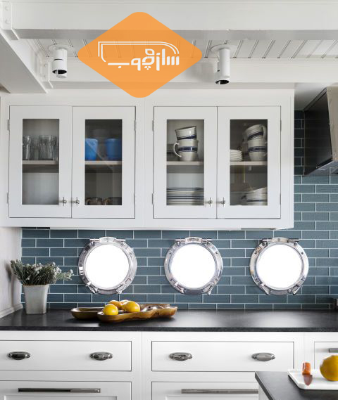
Use the white color for the wall between the kitchen cabinets
The white color creates a clean and energetic look in the kitchen. White color can enhance the sense of freshness. Using white in addition to neutral or soft colors creates a relaxing atmosphere in the kitchen.
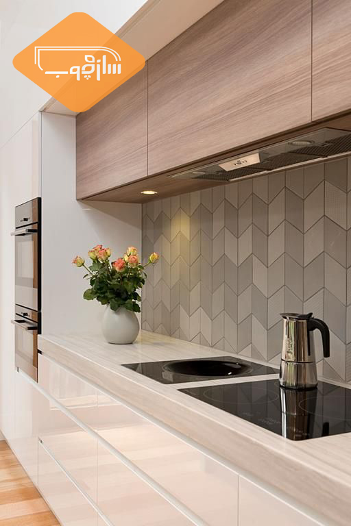
Use gray paint for walls between kitchen cabinets
Gray in the interior design gives ceremonial space. The effect of the gray color depends a lot on the shades you use with it.
For example, if the gray color is used with a yellow or pink tint, it will increase the heat of the space. But a beautiful shade of gray in a combination of white that is very bright can create a clean, elegant and refreshing look. If you have a lot of gray areas in your interior design, this color will prevail and create a dull environment.
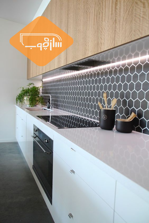
Use the black color for the wall between the kitchen cabinets
The black color is very suitable for displaying certain things in space. If black is used with light and beside neutral colors, any color that is black is highlighted.
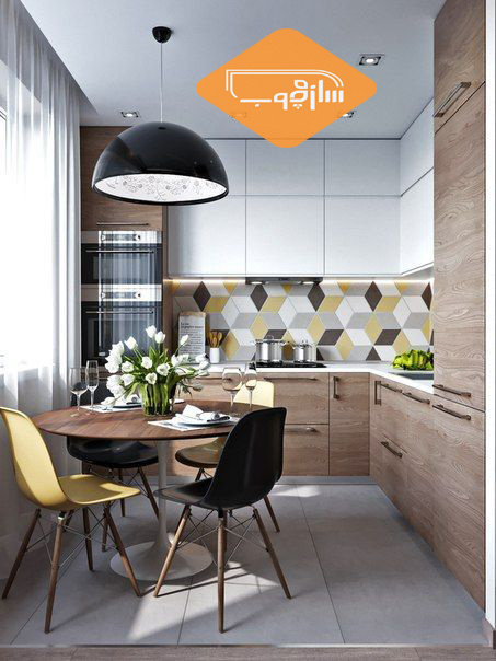
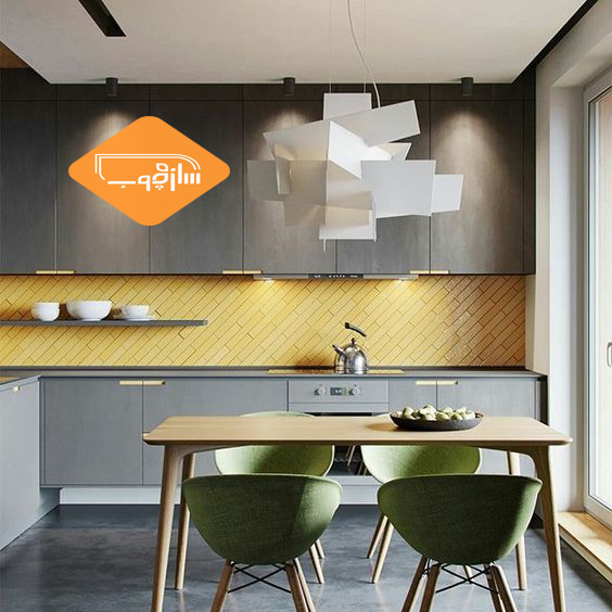
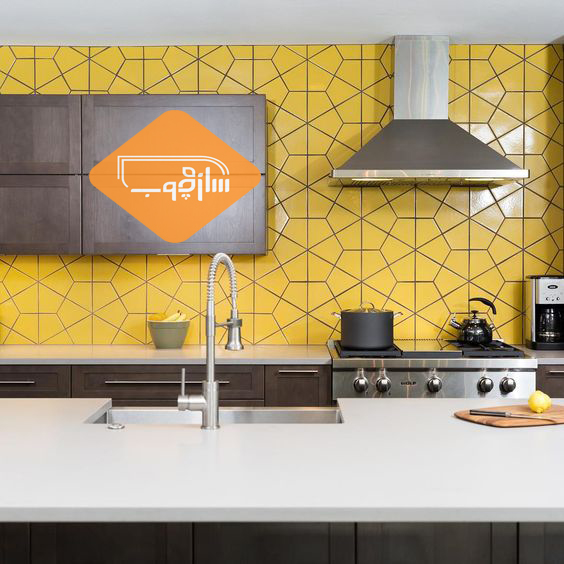
Use yellow for the wall between the kitchen cabinets
The use of yellow gives a bright and optimistic atmosphere. Yellow is just like black to highlight objects and gadgets.
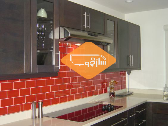
Use the red color for the wall between the kitchen cabinets
Using the red color gives you a stimulating and exciting aspect to space. Colors such as red and orange are known as appetite stimulants and are therefore widely used in kitchens.
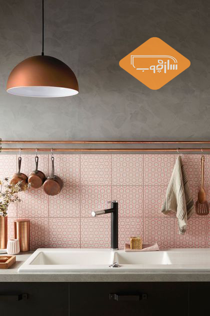
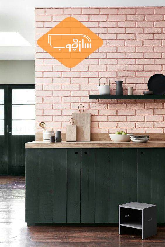
Use pink for the wall between kitchen cabinets
Pink color in the interior design creates a relaxing and comfortable atmosphere. Pink color along with neutral colors such as gray and white creates a beautiful and calm atmosphere.
Use the violet color for the wall between the kitchen cabinets
Purple color is used to create a luxurious environment at home. If it has a shade of blue, it can be gentle and calm and create a mysterious atmosphere. A reddish shade of purple color will attract more attention and control over space.
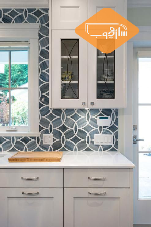
Use blue for the wall between the kitchen cabinets
The blue color reduces blood pressure and heart rate, resulting in a sense of relaxation. In the design of the interior, a very shadow of blue is used to enlarge the space.
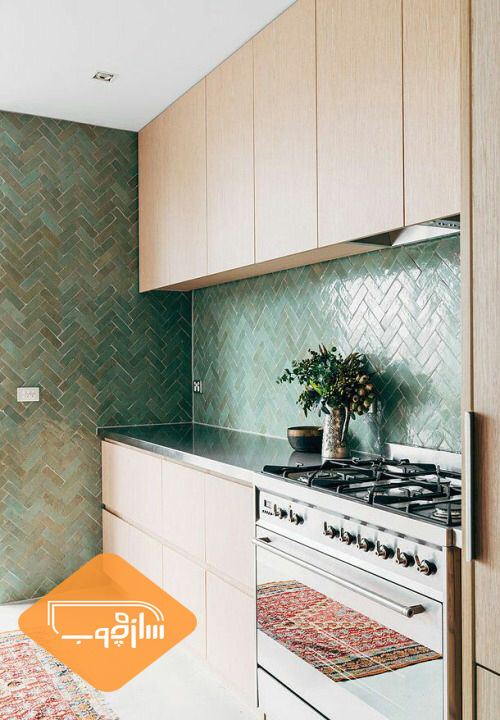
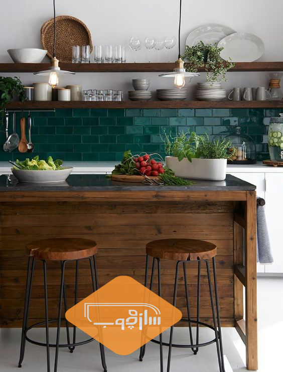
Use green for the wall between kitchen cabinets
The psychological effects of green are similar to blue, the green is perceived as a pale and bright color. Green is very relaxing for the eyes. The best way to use green in the interior design is to use the green color next to the brown color that is the color of the nature.